20 Personal Website Examples to Inspire Job Seekers
When you are looking for a job, the more information you can give your employer, the better your chances of landing the job. One valuable piece of information is your resume. Now there is also another important tool for your job search. A personal web page can tell your employer exactly who you are. With options like videos and links to other sites, like your Instagram or LinkedIn, you can show your future employer exactly who you are.
The best way to start building your website is to get some inspiration. There are many elements you need to keep in mind, such as the layout, fonts, colors, and of course, the user experience. Most websites have different designs based on the goal of the website. Your website can be a blog, a portfolio of your work, a way to showcase your resume, and even for general use such as branding.
Here are the 20 best personal websites to help shape your own web page. We categorized them so you can easily find something that best suits you:
Let’s start out with some portfolio websites. These sites highlight what the person has done in unique ways. While you may not use as many pictures on your personal webpage, these sites show how images can be used to draw a viewer in and highlight information and help guide the viewer through the webpage. You want your portfolio to emphasize what you are capable of. You want your future employer to know what they will be getting when they hire you.
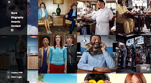
1. Tony D’Orio
Tony D’Orio’s portfolio is on the front page of this interesting web page. You can tell what he does and how well he does it as soon as you see his page. This is a fantastic example of a portfolio. Instead of using a resume or link to another site, he shows his unique photography immediately thus capturing the viewer’s attention. This is a good example of the use of photographs on your personal website.
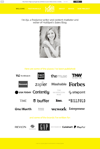
2. Aja Frost
You immediately know that Aja Frost is a freelance writer. Her simple to navigate site offers a look into her life and portfolio. She has a menu on the top of her page that is self-explanatory and easy to use and her picture shows her relaxed and happy. This is a good example of a picture you want to show prospective employers.
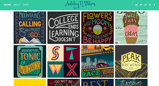
3. Ashley Diers
This site also has images on the first page. These images lead the viewer deeper into the life of Ashley Diers. She has links to her work, about, and shop page near the top of the website where they are easy to view and link to.
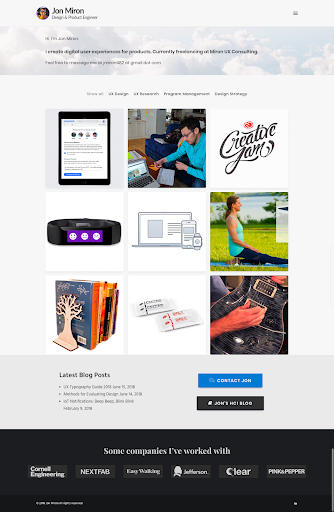
4. Jon Miron
Images appear as soon as the viewer opens this webpage. He also has his information right there when the page is opened. One click on the right-hand corner and the viewer is led to his resume and other pertinent information. Using a circular image on the corner of the first page make the viewer feel they know who they are dealing with.
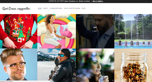
5. Gari Cruze
This website also starts with images, but each image leads the viewer to a more detailed account of Cruize’s work. His menu is whimsical and most links lead to his resume and contact information. He has links to his blog, about me, and references. There is also a link to his latest blog at the top of his page.
Next are some examples of different websites that show off people’s resumes. Highlighting your resume is important when you are on the job market. Within your resume, you want to include your work experience, education, any certificates you may have received references – or acknowledgments, and volunteer experience or honors you have received. It is important to get this information across as concisely as possible. When creating your webpage you want to look for the best website builder that fit your style. Some Squarespace templates may help you figure out how you want your resume to look and where you want your resume featured. Just remember to show off your talent both in your resume and on your website.
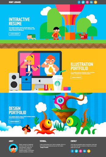
This site wins the award for the most unique resume. The viewer maneuvers this site via a video game format. You can either scroll down or use your mouse keys to go forward or backward. This is an interactive resume that keeps the viewer entertained while also loading them with information about Leonardi. The different parts of Leonardi’s resume can be found on the different levels of the game. Level one is an about section, level two is a skills section, level three is experience with drop-down lists of where Leonardi has worked, and level four is a balloon ride highlighting Leonardi’s awards and publications. The game ends with a direct link to Leonardi’s email. While this is a bit extreme, the website does show what information is useful to have on a resume.
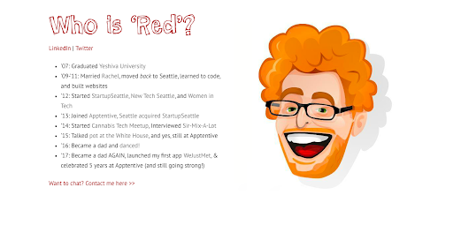
7. Red Russak
On the complete opposite end of the spectrum, this site is less interactive but informative. The caricature of Russak highlights what would just be a simple list. Within the lists are links to his school, his wife’s web page, and places he has worked. There are links to his other online accounts where viewers can find pertinent information.
8. Ian Enders
Along the same line as Russak, Enders has a picture and a list of facts about himself. He has links within the list and a direct link to his complete resume near the bottom of the list. His links lead to his wife’s website, his GitHub page, Twitter, and bog along with employers. It ends with a link to his actual resume. This and Russak are minimalism at its best. Both of these sites show a few of their designs to potential employers.
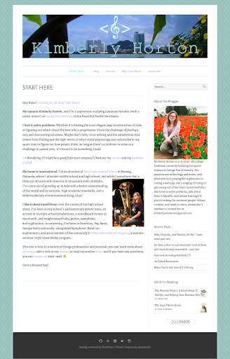
This site’s front page is a fleshed out resume. Horton provides numerous links to her actual resume, blog page, and contact information within her front page description. Viewers find out a lot of information about Horton without having to look far. She also has a link called “why I love music” and links to her resume and blog. The unique aspect of her page is the “Start Here” title of her homepage. She also discusses what she is reading at the moment. This is a fun page full of pertinent information.
10. JessDesignTan
This site is strictly a resume and portfolio with a link to contact information at the end. What makes it unique is the crisp design of the pages and coloring. Instead of listing a resume, the design flows through the information. There are about, skill set, education, and portfolio sections leading to a link to the designer’s Hotmail, Behanced, and LinkedIn accounts. The viewer does not realize it is just a resume until the end of the site.
11. Nik Papic
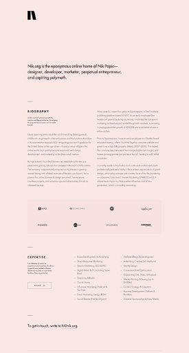
This site is minimalistic but informative. Papic lists what he does, his biography, work experience, and expertise with a link to his resume near the last page. There are also links to LinkedIn and Twitter. This has all the information an employer would be looking for. The fact that he states he is an aspiring polymath on the first page should draw any potential employer’s attention. Nik puts himself on the page in a unique manner. You should use this as an example of a good resume page and personal page.
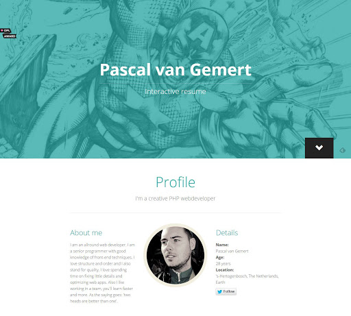
This website is another good example of putting your resume out front. The first page explains that the viewer is experiencing an interactive resume. The website starts with a profile and then lists experiences, abilities, and projects. The contact information is on the last page. The viewer can scroll down the pages or jump to a certain section using the menu on the right-hand side of the page.
One other important thing to remember in the job search is personal branding. This is what will pull your information together concisely. You can use a drag and drop website builder to make it easy for a future employer to access all your information in one site. When branding, be sure to use similar fonts and other identifiable features. Here are some good examples of personal branding in websites.
13. Raf Derolez
This site is a great example of branding. It is fresh and unique. It shows the designer’s work and has links to his LinkedIn, Codepen, Twitter, and Instagram accounts. There is also a prominent link to his email address at the end of the site.
14. Sean Halpin
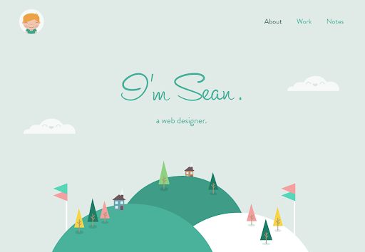
This whimsical site offers a unique brand. The designer is letting you know about their life and creativity up front. The web page designer discusses designing and developing websites for people. There is a link to a notes section that has an ongoing message board. There are links to dribble and twitter near the end and a direct email link.
15. Jasmine Star
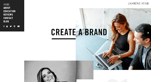
This site is not only a great example of branding, the creator actually helps people to create their own brand. So you can look over the site or contact Jasmine for help with your own branding. On this site Star links to Facebook, Twitter, Instagram, Periscope, and YouTube. She has a link to her blog and a link to get information from her about her business.
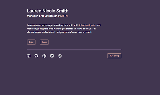
While this site may seem scarce, it does tell the viewer about the designer. There are links to her Instagram, GitHub, Codepen, Twitter, and dribble accounts. She also links to her dog’s Instagram account, her blog, and she has a cool 404 pong game link that adds some humor to her site.
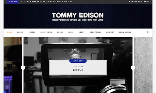
17. Tommy Edison
This is the site of a unique individual with a distinct brand. Tommy Edison has branded himself as the blind film critic. This is a great example of a brand blog and a resume blog. He links to his shows, photographs, latest news, and an about page. There are links to his unique videos and also his Instagram, Facebook, Twitter, Google Plus, blog and Youtube pages. His unique brand is found on all of these links. This page is to remind you that unique brands will get you far in this world.
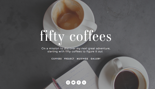
18. Fifty Coffees
This is a personal site that does not look like a personal site. The brand is Fifty Coffees. This site is about a person’s goal to have coffee with fifty different people to help her find a new job and direction in life. There are links to her blogs, musings, and gallery. She has links to her Instagram, Twitter, Facebook, and Tumblr accounts. This is a unique way of branding oneself that really works to catch the attention of viewers. And, by the way, the idea worked. She is now working with someone she had coffee with.
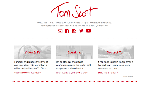
19. Tom Scott
He uses self-deprecating humor in his brand. His phrase is “they’ll probably come back to haunt me in a few year’s time.” This website is a brand for Tom Scott. It links to his Facebook, Instagram, Youtube, and Twitter pages. It also has links to his videos, speeches, and email.
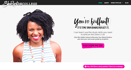
Her personal webpage, SheRocks@College, is a unique and fun page. She includes links to her Facebook, Twitter, and Youtube pages. The most unique feature of this site is the Facebook Messenger button that is a permanent fixture in the lower right-hand corner of the webpage. This is a direct link to the designer. While you may not want people who check out your webpage to have such a direct link, it should remind you to have links that you frequent often so you do not miss any important messages from future employers.
Final Thoughts
These personal website examples are examples of what you can accomplish with the right tools and a good imagination. You do not have to have an extravagant website to attract future employers. However, you want to have a unique website, not a cookie cutter example. Some people use a free personal website while others use paid sites. Whatever site you choose, make sure you have links to your other websites. Update your resume and highlight your skills. Make sure there are pictures that show the real to make the website more personable to prospective employers. If you combine all of the above into a unique page, you will have created something that you can be proud of that will catch the eye of future employers.
Once you begin the interview process, be sure to check out our other blogs to prepare and stay ahead of the competition:
- Restaurant Interview Questions For Every Position
- 77 Retail Interview Questions
- Common and industry-specific internship interview questions
- How to Follow Up on Job Applications
- How to answer the question ‘What are your salary requirements?’
- Health Plans You Should Know About Before Starting Your Job
About Deputy
Deputy provides built-in scheduling so you can easily create schedules, assign employees to shifts or shifts to employees, and sync schedules with payroll data to ensure accurate pay and control labor costs. To learn more, schedule a call with one of our reps below to see it in action.
