What is retail visual merchandising?
Visual merchandising in retail is the display and promotion of products in a way that encourages sales. Retail visual merchandising also helps customers to find products easier and generally makes the shopping experience more appealing and enjoyable. It’s no wonder it’s known as the ‘silent salesperson.’ Great examples of visual merchandising in retail are those that have a positive effect on the customer experience and profits.
Successful retail visual merchandising
Successful visual merchandising in retail entails creating attention-grabbing displays and floor plans to increase customers to buy more items. our floor plan can also serve as a shoplifting deterrent. The list of 10 great examples of visual merchandising below shows how retailers have capitalized on their store space to help boost sales.
Before we get to our list, below are some key considerations for successful visual merchandising in retail:
Color coding – There is a color for every mood and retailers should consider the power of color coordination when planning their visual merchandising displays. The use of the right colors can enhance a display even if the quality of the items are substandard. Contrasting colors help customers to take notice by drawing their eye to the display. It’s not only bold colors that attract attention – a simple black and white display could encourage customers’ interest.
Storytelling – Retailers who add the right words to tell a story through their visual merchandising are proactive in telling customers how their products will assist them. A lot of thought should go into storytelling because the message needs to be brief, attention-grabbing and useful. Visual merchandising is intended to catch the customer’s eye, so words or signage that requires someone to stop in order to read will be ineffective. Consider using no more than three short statements or words in bullet form to tell your visual merchandising story.
Blank space – Empty space in stores should be utilized as much as possible. However, retailers need to take a balanced approach when adding visual merchandising to their blank space. It’s not recommended that every inch of the shop floor is filled with visual merchandising. Instead, clever usage of blank space, like using signage in the space between the merchandise and the ceiling, won’t overwhelm customers. You could also use lifestyle and life-sized graphics to help customers form a connection with your product. For instance, a fashion retailer can draw attention to their new summer collection by using a display of someone at the beach.
Focal point – Given that focal points or hot spots can increase sales by 229%, retailers should pay attention to where the customer’s eye will be drawn to in their store. Successful visual merchandising should lead your customer to the items you want them to take notice of. Including too many focal points in your store may confuse the customer because they’re not sure where to look. Put yourself in your customer’s shoes when assessing your visual merchandising. Check whether you can see your display from different parts of the store. As well as making the display the focal point of your store, you should also make your products the central part of your visual merchandising.
Smell – It’s reported that 75% of people’s emotions come from what they smell, and they experience a 40% improvement in their mood when they’re exposed to a pleasant fragrance. This could be the reason that the perfume industry is worth $8 billion. Smells aren’t only suitable for food retailers like coffee shops. All retailers can use the power of smell to enhance their visual merchandising to give the customer a better experience. For example, a high-end clothes chop can use essential oils to help create a calm and inviting atmosphere.
Lighting – The use of appropriate lighting in visual merchandising helps to set the mood of the store. Bright lights create a modern feel while softer lighting gives stores a more intimate ambiance. The color of the lights can also reflect your retail brand. Lighting should be used to draw attention to your visual merchandising. Bold and bright lights can be used to highlight your display.
Music – Music is another way to increase the power of your visual merchandising. Music helps to solidify the visuals of your brand and create the right atmosphere in your store. Choosing the right tempo and volume will help to dictate the perception of your products. As a result, make sure your music matches the visual elements of your store.
Maximum products – Make the most out of your visual merchandising by adding as many products as possible to your display. Products should be presented in an organized way so as not to overcrowd the display. You want to expose the customer to as many items as possible to increase the chances of a sale. Show off your products on unique pieces, like unusual tables or other furniture to create that ‘wow’ effect.
Materials – There’s a lot to think about in terms of using suitable materials when organizing visual merchandising in retail. Here are some considerations for the materials involved in the visual merchandising of a retail store:
Flooring (tile, marble, or carpet)
Décor (shelving, wallpaper, and paint)
Lighting (spotlights, and brightness levels)
Mannequins (clothes, size, and color)
Outside signs (awnings, banners, and marquees)
Window displays (products, and signage)
Taking into account the key considerations above, here are 10 creative examples of successful visual merchandising in retail:
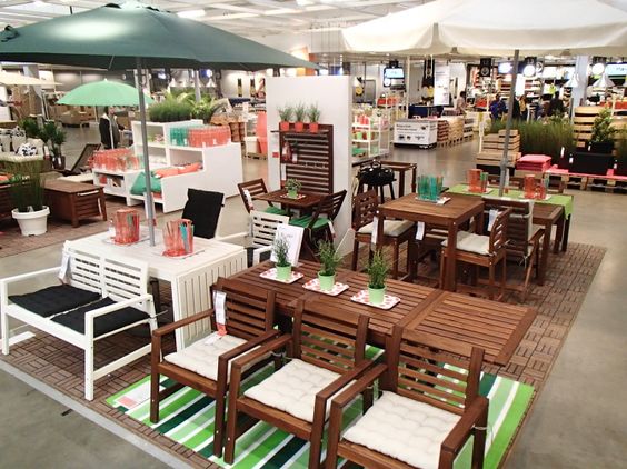
Customers find it useful to get a picture of what a product will look and feel like before they buy. Visual merchandising can help customers to picture how an item will look in their home or even how they will wear it.
The most common way to display items in a clothing store is to use mannequins. Another effective way that apparel retailers can paint a picture of their merchandise is to make it a policy for employees to wear in-season clothes that they sell.
Furniture stores are well-placed to dress their store to show how their pieces will fit in a home setting. A bed will be made displayed with other bedroom fittings to give a representation of a real-life bedroom. IKEA provides great examples of painting a picture using visual merchandising.
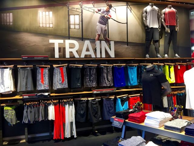
Clearly, signposting different areas and departments help to reduce customer frustration. Don’t leave shoppers guessing where to go next. Even if the customer isn’t looking for something in particular, your visual merchandising should introduce them to another area of your store.
Giving directions inside your store can be done creatively. Use a bold life-size image or large props instead of plain signs with arrows, so that customers can get a pleasant visual experience while being expertly guided through your store.
Unique artwork always creates a memorable experience. This concept works for different businesses, such as boutique hotels, pop-up stores, and retail stores. One-off pieces of art in visual merchandising give a store a distinctive and exclusive feel.
You can have some fun with using artwork in your store’s visual merchandising. Pieces of art can include paintings or sculpture and should tie-in to your brand in some way. However, abstract pieces will also work as they will create intrigue. To really set yourself apart in retail visual merchandising, why not use your products to inspire your artwork? The example above shows how you can use unique artwork that is aligned with your products to get customers to take a second look.
Grouping products help the story-telling aspect of retail visual merchandising. Place products that complement each other to encourage cross-selling. For instance, a bag can be grouped with shoes, trousers and a top to show the customer what a complete outfit will look like.
You can also group items based on color to create a more visually appealing display. As mentioned above, avoid overloading your visual merchandising displays to give a clean and organized finish. If you’re showing plain, everyday products, think about adding an unusual item to get the customer’s attention. The example above uses a small teapot and a cup to add contrast to the men’s clothes grouping.
Flowers promote relaxation and a sense of calm, so remember to use them when visually merchandising your retail store. Flowers are popular gifts because they make the recipient feel special. Your store’s flower arrangement can be a large statement bouquet or smaller flowers strategically placed around the store. The scent of fresh flowers will also result in your store having a fresh and inviting scent.
If you don’t have the budget for fresh flowers, research suggests that even looking at a picture of nature has calming and relaxing effects. Therefore, images of flowers can work just as well in visual merchandising as fresh blooms. The example above shows Kate Spade’s imaginative and creative use of flowers for a Valentine’s Day visual merchandising theme.
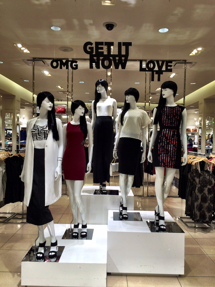
Social media language is brief, to the point and impactful. This is because people’s attention spans are becoming shorter due to all the information they consume. It’s a smart idea for retailers to use social media language in their visual merchandising, especially if they’re marketing to millennials.
Using language that people use online in your store visual merchandising will help invoke a feeling of familiarity with your brand. Your brand will also be seen as on-trend when using the latest social media lingo. Utilizing this strategy in your visual merchandising is especially useful if your store has an online presence because customers will be able to make the connection between your physical and virtual store.
A word of caution when using social media language in your visual merchandising is to use it in moderation. The example above is a good case in point because they have only used one social media slang term out of three phrases.
Give your retail visual merchandising the technological touch by including interactive features in your displays. Customers appreciate unique experiences and adding interactivity in your visual merchandising fits the bill. Interactive touches can include grand displays like Ralph Lauren’s and Bloomingdale’s partnership of window displays featuring HD plasma touch screens that allow customers to select customized items of clothing.
An increasing number of retailers are using virtual reality in their visual merchandising efforts. Customers are encouraged to use headsets that provide a virtual experience of using the products. For example, customers can see how a piece of furniture would look in their actual home. Although the use of virtual reality in retail visual merchandising is still in its infancy, its popularity may increase since customers are always on the lookout for a more immersive shopping experience.
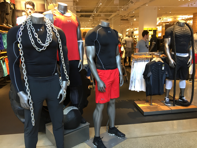
A key part of visual merchandising in retail is the ability to showcase as many products as possible without making the display look crowded. Unfortunately, some retailers take the idea of scarcity too far and fail to fully utilize the mannequin. Dressing the mannequin in only one piece of clothing is a wasted opportunity to show which products will go together.
To make the best use of your mannequins, create a theme around each one and dress them accordingly with the right clothes and accessories. Take every opportunity to give customers ideas about how they can use different items in your store to put together a complete look. The image above shows how Under Armour dresses their mannequins for maximum effect.
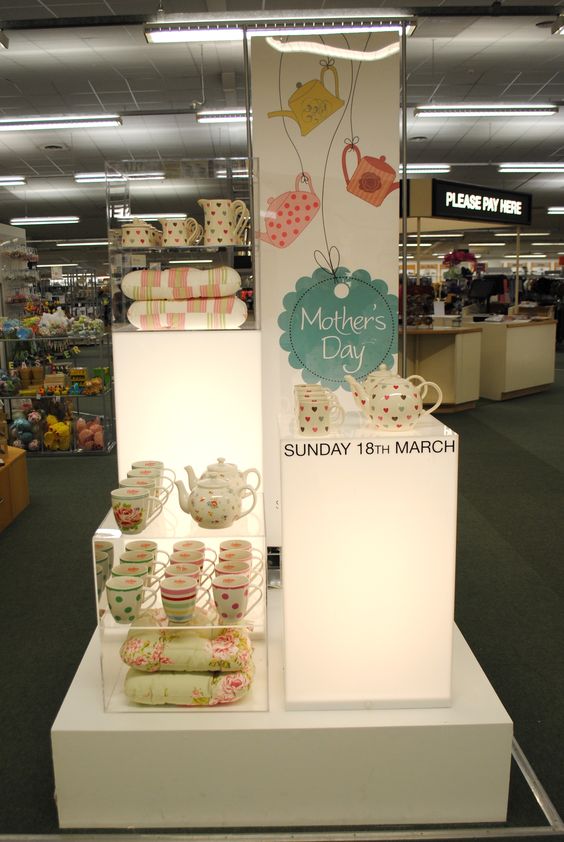
Seasonal products for special occasions, like Valentine’s Day or Mother Day, should always be displayed at the front of the store. Ideally, you should update your store window with a seasonal theme, but well-placed products can have the desired effect of attracting customers to shop for the special day.
As well as enticing customers to buy your seasonal stock, displaying in-season items at the front of your store will decrease the chances of you being stuck with an out-of-season inventory. Incorporating seasonal items in your virtual merchandising efforts will help you to attract new customers who will hopefully shop with you all year around.
Using visual merchandising in your cash register area is consistent with the idea that every area of your store should be used to enhance the customer experience and sales. Your point-of-sale display should jog your customer’s memories about items they forgot to pick-up. The example above is a merchandising display that can be placed by the cash register, which makes it easy for customers to grab something at the last minute.
Final thoughts
The 10 examples of visual merchandising in retail above show what can be accomplished with some imagination and creativity. Whether you own a small or a large retail business, creating the right atmosphere to put customers at ease is a must. Adding personal and inexpensive touches can work wonders in giving your retail store a unique personality. Remember to engage all the senses when implementing visual merchandising in your retail store. Smells and sounds add to the visual to create a shopping experience your customers will love.
Want to stay up-to-date on the retail industry? Subscribe to the Deputy blog and see why retail business across the globe use Deputy as their all-in-one employee management solution. Our mission is to help improve the lives of employers and employees, using technology to transform operations and help businesses thrive. Try out Deputy for free and see if it’s right for your business.
