What Makes a Good Restaurant Logo Design?
Imagine ordering a cheeseburger at several different restaurants. None of these restaurants have logos or distinctive symbols on their glasses and plates. There are the same designs, colors, and styles. Now can you tell what cheeseburger was the best? What restaurant did you like most, and why?
It’s not enough to offer good food if you want your restaurant to be successful. There are too many competitors in this business. At the same time, it’s hard to create something new because the chances are somebody else is already serving the same dishes and drinks. You need to make your restaurant memorable, attract new customers, and turn them into loyal customers. A good logo and a smart branding strategy can push your business to a new level, increasing your profits in no time.
Why is Branding so Important?
If you want to see how your business thrives and grows, you need to get serious about branding. This factor determines the success of your marketing strategy and is crucial for any restaurant, due to the specifics of such a business and a number of competitors. According to the estimations of some researchers, there are more than 15 million cafes, restaurants, and pubs in the world. Obviously, the real number may be much bigger.
Choosing the right branding strategy, you can increase awareness and interest so that more people will recognize your brand, and your business will stand out from the crowd of similar establishments. Nobody will recognize your restaurant if it doesn’t have its identity. You just need to find it and make it visual. If you have no idea where to start, here is our advice: There’s nothing more important about your visual identity than your logo.
Why do You Need a Good Logo?
Your logo is an essence of the whole brand. It should reflect the brand’s design and colors, theme, and values. The main purpose of any logo is no different from that of any other means of marketing — you have to tell a story and make it engaging. At the same time, a logo implies working within an extremely concise format. Thus, you need to use everything you have: colors, various fonts, shapes, or even unique materials.
Good logos make visitors think about an idea that underlies your brand. They are able to form an opinion even before they’ve visited your place and ordered their first dish. This is a reason why logos are a priority for most restaurants, and owners are willing to spend a lot of money to get a logo customers would identify with.
Logos are the most recognizable marketing tool, which makes this element of your branding strategy crucial for creating a base of loyal customers. Not only does your logo determine the initial impression on new visitors, but it also provides an image for loyal customers and transfers the message of your restaurant. There is no surprise that many leaders of the industry owe their success to an enchanting logo. This is also a reason why designers see an opportunity to make the most of their creativity when working on logos for restaurants.
Elements of Logos that Encourage Curiosity
Fonts are very important, no matter is it a logo or a slogan. If you want to include certain text in your logo, we suggest making choice based on such factors as simplicity, and accuracy. If your font is hard to read, the logo will look unprofessional and less attractive. Your font should also easily blend with the whole design of the logo. Simple and easy-to-read fonts make your branding straightforward and understandable for a wider audience. Your font should attract attention and deliver your message instantly. If you plan to print your logo on tablecloths or napkins, simplicity is what will allow you not to sacrifice some details when printing.
Colors are another crucial element of logo design. The whole brand may be based on one color that evokes the right associations. The importance of colors is determined by their direct impact on our subconscious. Every color means something. For example, red is associated with energy and intensity, green is natural and calming, and so on. In the food industry, vibrant colors are not recommended. We suggest sticking to natural shades that are associated with natural food. If you choose to use several colors, keep in mind that they must complement each other according to the rules of harmonization. All colors also have their cultural meanings, for example, in the U.S. and Europe, white color is associated with purity, while in Japan it’s a color of grief.
You can change the size of different elements and the amount of negative space, bringing attention to particular details of the logo. The size of the whole logo is also important because you may need to scale it. The point is to make your logo easy to resize so that the original design won’t lose its readability or important details. Another important thing is shapes. Memorable shapes can make your brand recognizable in no time. However, you also need to be careful when experimenting with shapes. The simpler and the more classic solution you choose, the faster people will remember your logo. Basic shapes like triangles or circles never get old. If you combine them with interesting fonts and colors, your brand will be readily recognizable.
Examples of Outstanding Restaurant Logos
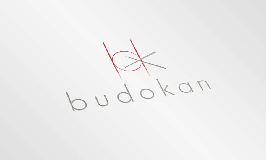
Restaurant Budokan has a logo that represents minimalism and balances between abstract and representational approaches. It’s simple and figurative. For example, a red figure resembles a plate and is also similar to the letters “b” and “d”. These visual associations are sort of a hook that makes people recognize this brand.
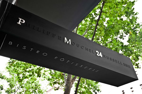
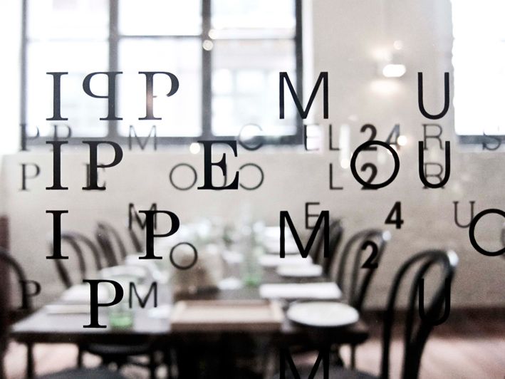
Philippe Mouchel, who is a chef of PM24, decided to find a brand identity that would reflect the sophisticated nature of the menu, being exquisite and audacious. This logo design relies solely on a typographic approach, making you focus on several key letters among dozens of other characters. This design is unique and has nothing to do with traditional solutions. In this case, creativity is what plays the key role and makes this brand so good.
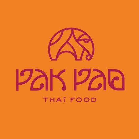
A combination of ethnic traditions and modern style is a great way to present Thai food. The design of Pak Pao logo resembles traditional Thai typography. A color scheme is also a reference to Thai monks’ clothing. This logo speaks of culture and history. At the same time, it’s minimalistic and simple. This design is recognizable and unique, which makes it a great solution for the restaurant.
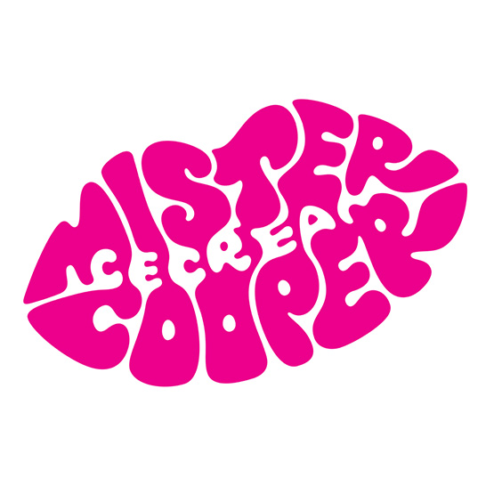
Mister Cooper is an ice cream brand that is targeted at adults only. There are alcoholic ice cream and other flavors that you won’t find anywhere else. This logo is psychedelic and evokes associations with the 70s and experimentation. These letters are literally melting like ice cream, and even negative space is used with a purpose, spelling out “ice cream.” Finally, this logo is a sweet kiss that makes any product look tasty and desirable.
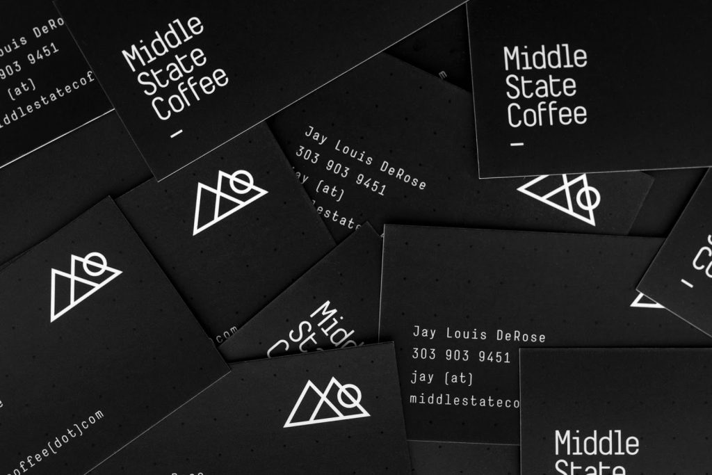
Middle State Coffee’s logo not only is perfectly geometrical and minimalistic but also tells a story. This coffee is brought to Denver from Colorado, and its logo depicts mountains and sun. This design is elegant, modern, and perfect in its simplicity. In addition, the picture of mountains also resembles an “M” from the name of this brand.
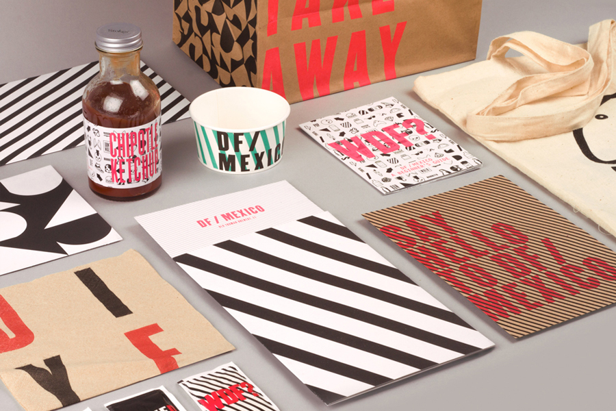
DF/Mexico is a diner located in London that serves modern Mexican food. To stand out from the crowd of competitors, this brand adopted an unusual design which is based on typography. Eye-catching stripes and colors popular among fast-food brands look flashy and hip, perfectly targeting the young audience.
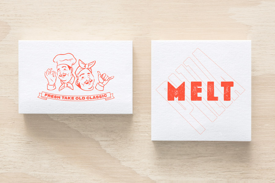
Melt Pizza is a great example of a new approach to an old classic. White boxes with red logos and retro pictures of Italian chefs are what everyone would associate with Italian pizza. A creative use of typography allowed designers to make this logo look modern in the simplest and the most natural way possible. Thus, don’t be afraid to use old clichés if you have good ideas.
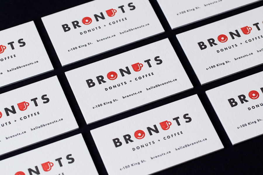
Bronuts is not only a fun word but also an explanation of this brand: This cafe is owned by two brothers. They serve donuts and coffee, and both products are present in the logo. The whole branding represents simplicity and positive vibes — a perfect combination for customers who want to meet their friends for a cup of coffee.
How to Create a Good Restaurant Logo to Attract Visitors
- Creativity
- Differentiation
- Storytelling
- Positive associations
- Don’t try to be too trendy
- Be consistent
- Make it dynamic
Creativity is crucial for any successful branding strategy. Creative logos catch attention and evoke various associations. The majority of consumers form their opinion when making the first purchase, and it’s really hard to change this opinion later. Moreover, most people become loyal to a certain brand when they buy a product for the very first time. Therefore, you need to invest in creativity in order to create a unique brand identity that will make your company appealing. When customers see a creative logo, they expect a completely new experience, while mediocre logos make your brand look less trustworthy, as customers see that you failed to make it better.
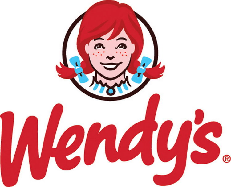
Your brand must be different from others. A great logo should represent a distinctive identity that is reflected not only in service but also in packaging as well. It’s not so difficult to be unique if your brand delivers a message about your values. For example, Wendy’s uses an image of the founder’s daughter. Unlike their competitors, Wendy’s not only serve burgers, they also deliver a message about family values.
Just think about your customers. Who are they? Why do they choose your restaurant? What is especially interesting about your food? Is it traditional or innovative? Is it authentic? Do you use any unique ingredients? If you deliver this information to your potential customers in any way, they will understand why they should visit your restaurant.
James Stewart, a writer from Masterra who’s been working as a designer for many years, notes that positive vibes are of the highest importance to any restaurant. Most people don’t realize that it’s not food what they are looking for, it’s a good place where they can spend some time and leave it with good emotions. Since your logo is the first thing your potential customers see, it must put them in a good mood. Of course, the chosen theme depends on your targeted audience, but there’s one thing you can be sure about: Your logo shouldn’t bring any negative associations.
Trends always change faster than we expect. On one hand, choosing a modern logo that represents the latest trends in design will make your restaurant more attractive to people who keep up with trends, and the younger audience in particular. On the other hand, such an approach means that you will need to update your logo every few years, which involves developing a new branding strategy and spending additional costs. Unlike the newest trends, some classic solutions will never get old, making your brand timeless and hence even more recognizable.
Building a new restaurant brand takes time. You need to keep in mind the whole strategy and make all the small decisions based on the general concept. Don’t change colors and fonts too often because you may lose loyal customers who won’t recognize the brand they love. Follow the main idea of your brand everywhere: on your website, in advertising, in your interior, and printed materials. Consistent brands are perceived as more reliable and so attract more customers.
Dynamic logos turn out to be the most popular and the most effective. Such a popularity of dynamic logos is easy to explain: Your viewers get more engaged and interested in your flow. If you are thinking about dynamic solutions, make sure your logo is flexible enough to be used in an interactive way. However, don’t forget that static logos still have a lot to offer.
Conclusion
It’s not easy to own a restaurant and work on its branding strategy. There are too many competitors, and most of them offer the same things as you do. Given that customers are quick in forming their opinions, you should use any opportunity to explain why your restaurant is the best choice. This is impossible without a logo that reflects the idea of your brand and its distinctive features.
Your logo may be minimalistic or sophisticated, it may refer to the classic solutions or present a completely new look that nobody else has. The main thing is to deliver your message and put your potential customers in a certain mood, offering more than just tasty food.
Invest in your restaurant
Owning a restaurant, or any business involves more than creating an effective logo. It involves hiring the best staff, training, scheduling, inventory management, HR policies, and much more. In order to have a smooth opening week, your business needs to be able to handle these tasks and demands from the kitchen, behind the bar, at the hostess counter, etc.
Deputy makes it their mission to provide employers a solution to streamline business operations using technology. By simplifying scheduling, timesheets, tasks, and workplace communication, Deputy can transform restaurant operations. To learn more, set up time with one of our reps for a customized demo to see it in action:

